Ray Stenning of transport design studio Best Impressions cut his teeth with involvement in the bus and coach industry, but he can claim an impressive CV in railway design and branding. Steven Knight speaks to Ray and finds out what motivates him, what sparked his creative flair, and what he thinks of today’s railway design.
NOTHING generates more debate in the transport industry than livery and branding. Everyone has a view and there are dozens of professional companies that claim they can produce outstanding branding and liveries every time. Everyone in a business, especially railways, from boardroom to platform, will claim to be an expert in design. Ray Stenning and his team at Best Impressions are the experts, not just in design but in transport design.
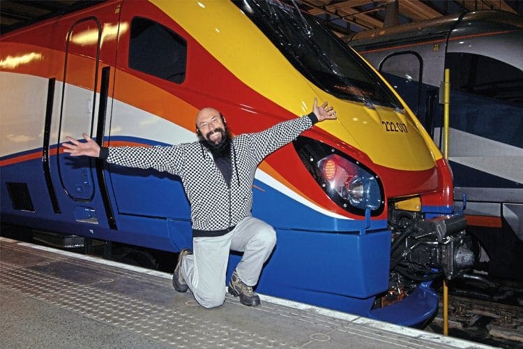
Ray’s career spans more than 40 years and while his design roots are in the bus and coach industry, the privatisation of the railways in 1996 opened more doors. This was not surprising as the bus and coach groups that he has worked for were at the forefront of successful rail franchise bids.
Travel around the UK rail network today and it is likely you will see examples of Ray’s work, but it will probably not register that it is from the Best Impressions stable.
Enjoy more The Railway Magazine reading every month.
Click here to subscribe & save.
It would be fair to describe Ray as a colourful character who, as a boy, had an interest in all things related with transport, but perhaps a greater interest in trains. It was while at school that he also developed a keen interest in buses. Like many transport professionals, there was a period when he considered the transport hobby was, in his words ‘nerdy’. But perhaps his nature was to fight against what may have been seen as being conventional, and he maintained and developed his interests.
Ray was born in Horsham, Sussex and went to art college in London. He then spent time helping run his parents’ grocers shop in Somerset, but the desire to earn money meant there was few jobs he would turn down.
He became a part-time coach driver in 1979, but not the image of coach driver many would have expected to see – he had a hairy biker appearance.
However, Ray was eager to get back to his roots and into graphic design. Best Impressions was formed, and it is not surprising that his first big commission was to design a livery for coach company Bakers (now Bakers Dolphin), which is still in use today.
So how did Ray get involved in railways?
It was a natural progression with key bus and coach groups becoming involved in railways.
“It was the onset of rail privatisation, and we had been dealing with several leading figures in the bus and coach industry, whose activity crossed over into railways,” Ray said.
Challenging work
“Our first work was conceptual for National Express when they were expecting the go-ahead in their bids for both South West Trains (SWT) and Gatwick Express (GEX).
“Success with SWT and GEX was not to be, but they did win Midland Main Line. The design work was challenging, given that other developments of the brand identity was done by a separate agency.
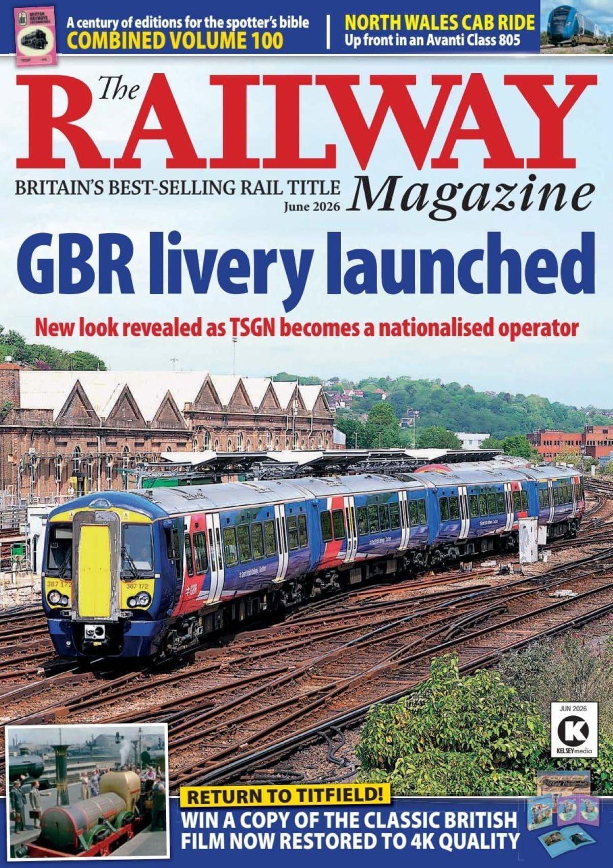
“We had the task of coming up with a livery scheme for the trains. And so the Midland Main Line teal and orange livery was adopted, with a deliberate nod to the great streamliners of yesteryear.”
Ray openly admits that there was some opposition from some of the more established agencies, probably fuelled by the outrageous passion that fuels everything Best Impressions does, and of course Ray’s personal flamboyant style with an image that is anything but conventional.
Ray does not hide his sexuality, which has in the past resulted in some prejudice from within the industries in which he has worked, but says people should take him for what he is, as he does them. It can at times be hard to remember that Best Impressions is a business with 11 staff and not just Ray Stenning.
But back to Midland Mainline and Ray admits that there was an alternative colour scheme that made extensive use of maroon!
A similar joint approach with brand agencies saw Ray and his team develop the liveries for both Silverlink and Central Trains, which were also part of the National Express rail portfolio. Ray describes his work for Silverlink as producing a livery that was “a bit wild, but with controlled use of colour”.
A big break in terms of an overall brand and design package came from Go Ahead in 2007 when Best Impressions got the job of producing concept material to support the bid for the combined Silverlink and part of Central Trains franchise.
“We did the concept work and even came up with the London Midland name,” says Ray.
The bid was successful and Best Impressions than created a complete image from station signage and branding, train liveries and interiors, to publicity material, and went on to produce award-winning marketing campaigns.
“We even created a bespoke London Midland font,” he adds, describing the London Midland livery as “bold, cool, sharp and fresh giving a clean, modern and professional appearance”.
Ray had worked closely with Stagecoach on liveries, branding and publicity materials for its bus operation, so it was not unexpected that he was approached to come up with a livery for South West Trains’ Class 442 Wessex Electric units. This was followed up with schemes for the Class 458s, 159s, and then the fleet of new ‘Desiros’, due to join the fleet. The project eventually created a family of products with differing colour schemes for Long Distance, Suburban and Inner-Suburban services.
Subtle differences
Then, when Stagecoach was awarded East Midlands Trains, Best Impressions was challenged with creating a livery with a ‘family resemblance’ to that of South West Trains. The result was a visual differentiation of express and local trains through two distinct, but related, liveries with subtle differences.
At the start of last year Ray and his team were invited to produce a livery with a
high-visual impact for Virgin Trains East Coast, the franchise that is owned by Stagecoach and Virgin. Initially, it was to have been a partial ‘wrap’ livery. However, the cost was not that much greater for wrapping the complete train. The brief was an unusual one, to create a livery that had a family resemblance to the Virgin West Coast livery… but was different! The result is extremely eye catching, and 12 months on from the start of the East Coast franchise all trains now carry the new branding.
In 2014, Ray’s team worked on a new image for Northern Rail for the Class 319 trains which had been transferred from Thameslink, creating the Northern Electrics brand.
Currently, Best Impressions’ creative input can be seen on trains and stations operated by London Midland, South West Trains,
East Midlands Trains, Virgin Trains East Coast and Northern Rail, as well as the Sheffield Supertram operation.
Previous schemes have included Silverlink, Central Trains, Virgin Trains (West Coast) Rail Links, First Hull Trains and West Anglia Great Northern, as well as printed materials for Thameslink, plus concept work for a number of franchise bids, including Stagecoach, Arriva Trains UK and Europe and Manchester Metrolink.
Ray is well known for creating the ‘wow’ factor, which is really evident in his bus and coach industry projects, but surely he has to be more restrained in the rail industry?
There is also a perception still in parts of the rail industry that things have to be done a certain way because that is the way they have always been done. Is this a scenario that Ray recognises?
“You have to be a bit of an engineer as well as a designer. Before you can begin to design a railway image you need to know what is technically possible.
“You have to understand the technical and safety restrictions but also break down historic barriers that engineers are used to. It is also important to get your hands dirty and work with the engineers when both developing a livery and also during its application.
“It’s necessary to earn the respect of engineers and for all involved to understand we are all on the same side at the end of the day.
“When we signed off the Virgin Trains’ livery for the East Coast route, we found a terrific pale grey vinyl which had metallic/pearlescent properties. It would have been gobsmacking, but although designed for vehicle wrap applications it had not been used before on a railway project and was not approved.”
Brand guidelines
While Ray and his team will be given total freedom on some projects, there must be occasions where the design brief is extremely prescriptive.
It really is the case that the bigger the company the more protective they are of their brand. Many have brand guidelines running to reams of pages detailing the minutiae of how their logo must look.
In my time in railway public relations, I was involved in a PR launch for biofuel when the normally red Virgin Trains logo was changed to green. It seemed the obvious thing to do, but fell foul of brand guidelines on the logo colours and its use and was never done again.
I asked Ray how he overcomes such situations?
“It’s all about partnership. Understanding the concerns and working together to develop a solution. It’s about thinking outside the box.”
So what makes a good railway livery?
“It is all about making sure that the livery works with the architecture of the train to enhance the total appearance.
“The train needs to be viewed as a whole and not a collection of individual carriages. The curved body profile on many trains allows the livery to make better use of light, reflections and shadows. We have charts that allow us to look at the light reflectiveness of the materials that we use.
“An understanding of architecture is a great asset and architecture is one of my passions.”
An example of a ‘whole train’ livery is easily seen on the Virgin Trains East Coast rolling stock, where structured use of red at the carriage ends seamlessly links one carriage into the next.
Ray adds: “It is also important to understand the train. While it would have been visually attractive to have continued the white area of the East Midlands Trains livery onto the HST power cars, this would have been impractical due to the fact that the trains’ bodysides at the time suffered from oil deposits from the Paxman engines.
“The design we came up with keeps the train appearing as a single entity while also enhancing the lines and the features of the bodywork.”
Just a few days after I had met Ray, new rules on the use of yellow ends on rolling stock were introduced. These do away with the requirement for yellow ends where headlights meet the latest standards on new and modified trains. It seems that Ray is happy accommodating the yellow where it is needed. In his typical style, he said: “I know how to work that yellow end and make it sex on wheels!”
On many liveries, Ray has made extensive use of strong leading shapes or swooshes to create visual impact at the driving car ends, which he describes as particularly important on some of the less-than-pretty plonky ends of gangwayed multiple units. It’s like an overture to an opera or a preface to a novel.
Brute power
At this point we discuss the merits of the First Group livery. Ray is extremely complimentary of the dynamic lines version used on the Great Western HSTs, but says it has probably outlived its effectiveness and has also been let down by the plain, all-over blue HST power cars. As for the urban landscape and regional liveries they were “cluttered and lacked fluidity and harmony”.
Our discussion drifts back to the image that the railway had in the past.
Ray was particularly impressed with the Railfreight schemes introduced in the 1980s with what he describes as ‘heraldic’ designs that had overtones of and resonances with the pride of the great guilds of yore.
Also high on his list is the BR ‘large logo’ livery, but he also says that the BR blue livery with large yellow ends on the ‘Deltics’ emphasised the brute power and majesty of the locomotive. It related to their purpose and emphasised their form.
However, I sense a favourite design is that of the Class 52 ‘Westerns’, operated by BR’s Western Region and for the best livery they were in, well, that is desert sand.
And what does Ray think about the bland images presented by the likes of Thameslink Great Northern and Abellio Greater Anglia.
“It’s a Department for Transport colour scheme. Its not a livery. It doesn’t project well as a memorable image.”
There is one other area where Ray has strong views. The interior of the train. “It’s vital to have a great livery that communicates all your brand values and aspirations, but it can be quite underwhelming once inside the train or bus.
“Sadly, there are still too many examples where vehicle interiors are not only disappointing, but are depressing due to acres of the same bland battleship grey everywhere, or worse, moquette with vomit or graffiti- inspired designs woven in garish hues.
“The interior is a follow-through from the exterior; it must deliver and not disappoint.”
So, for now, Ray is back to doing what he does day in and day out, creating stunning visual creations for transport companies.
As he puts it himself: “We create desire”.