October 1987 saw BR launch a bold new image for its Railfreight business. Thirty years on Ben Jones looks at how the image was applied across the fleet.
IT WAS the dawn of a new era for BR’s Railfreight business – a bright new image with bold graphics, locomotives and wagons dedicated to specific areas, and an end to scruffy, unkempt ‘general use’ locomotives.
The allocation of staff and resources to specific freight business sectors in the
mid-1980s had proved a great success, but it was felt that the Railfreight brand did not reflect the renewed strength and confidence of the sector.
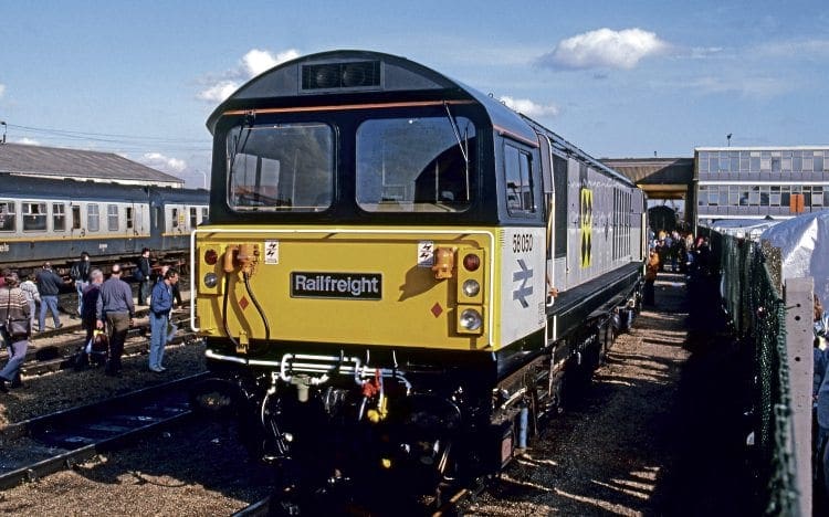
So, in October 1987, Railfreight was relaunched with a new colour scheme, combining three-tone grey paintwork with colourful sector symbols and imaginative depot plaques.
Enjoy more Railway reading in the monthly magazine.
Click here to subscribe & save.
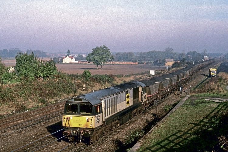
Taking its cues from military aircraft markings, Roundel Design produced a new combination of neutral base-grey shades and bright primary colours to create a strong ‘squadron’ identity for each of the five sub-sectors – Distribution, Coal, Metals & Automotive, Petrochemicals and Construction.
They were designed to project a modern, positive image for BR’s freight businesses.
Between 1987 and the creation of the three regional Trainload Freight companies in 1994, more than 500 Railfreight locomotives received the new identity, with some retaining it well into the 2000s.
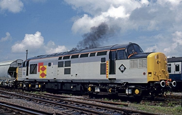
A sixth ‘parent’ marking was devised for the overall Railfreight brand and used mainly on promotional material, but only a few locomotives ever carried it.
Like the Network SouthEast branding launched in 1986, Railfreight’s new identity cleverly retained close ties to the celebrated British Rail corporate image, such as the cast metal double arrow logo and standard BR typeface.
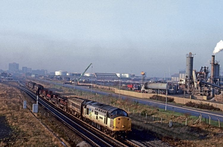
However, it wasn’t just locomotives that benefited; wagons, road vehicles, buildings, signage, promotional material, and even stationery all received the new branding, reinforcing the message Railfreight was a successful, cohesive operation.
Read more in the October issue of RM – on sale now!