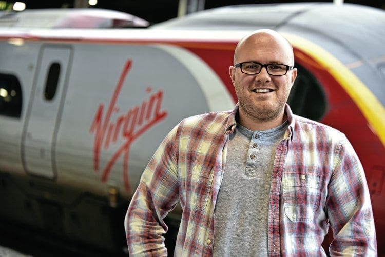
While many transport companies look to external agencies and specialists to develop and maintain their brand and image, some undertake the activity in-house. Virgin Trains was one of the companies that until recently had its own design unit. Steven Knight speaks with creative designer Sam Jessup, whose artistic talents were used by Virgin Trains for almost 10 years.
Sam Jessup has made a name for himself over the last decade as a leading light in railway design. His ability to interpret basic ideas and create something amazing has been put to the test many times.
Enjoy more Railway reading in the monthly magazine.
Click here to subscribe & save.
He has the ability to know what will work and what should be avoided. Until a few days before The Railway Magazine met him he had been working for Virgin Trains undertaking assignments for both the West Coast and East Coast franchises as well as for Virgin Rail Group and Virgin/Stagecoach.
A change in strategic policy at Virgin, which took place in December 2017, saw the brand and design functions being undertaken again by outside agencies, and as a result Sam left the business.
He admits to having a life-long interest in railways, which he says was probably down to his introduction to Thomas the Tank Engine at an early age. However, like many, this passion was kept in check as it was viewed as uncool during his teenage years.
A degree in graphic design at Falmouth College of Art was followed by three-and-a-half years working in Miami at a design agency run by British people. However, the recession took its toll and Sam returned to the family home in Coventry, and at this point decided to see if Virgin Trains had any jobs going in the city.
“I thought there may be something on the station or in the ticket office,” he said, “but I saw a vacancy for an in-house designer so I applied.” After a thorough interview a then 24-year old Sam Jessup joined Virgin Trains as its sole in-house designer in January 2008, based at Euston station.
During his 10 years at Virgin Sam went from being the sole designer to managing a design team of four. He has also worked with outside creative and design agencies, including working with respected transport designer Ray Stenning, of Best Impressions, on the East Coast launch in 2015 (RM June 2016).
Sam says one of the challenges in his early days was building relationships with other departments and encouraging two-way working, something that wasn’t on the agenda previously when outside agencies were used.
“My ethos”, says Sam, “was to understand the business, look at the end use, solve problems and then see where things could be done better. It was about adding sparkle and moulding the tone of voice to really create impact.
“Any brand has to be forward thinking, and for Virgin Trains it also had to embrace the values of the Virgin Group – welcoming, fun and different.”
CHRIS MILNER
Sam argues the biggest asset a train company has in selling its wares and promoting the brand is its people and trains. “It’s about selling a vision. The train is the hero. It’s the first thing people see when they and the train arrive at the station. The train has to create the ‘WOW’ moment, which then has to follow through with staff, facilities, service delivery, and the on-board ambience.
“Railway branding is a tricky art. It needs to be big, bold and bright, but also needs to be considerate of the market that its serves.”
What Sam is saying is there needs to be a different approach for commuter and
long-distance markets. He adds: “Take the recent London Midland livery and branding. It has a business-like look, but has been softened at the edges.
“The use of the colours and how they are applied to the trains can only be done once the target audience has been identified. For the passenger the identity must also reassure.”
I ask Sam what he thinks about the image of current railway operations.
Here, he believes the railway is starting to lose its personality and doing things that were unique has in many cases been cast aside.
I can’t help think Sam is referring to some of the Department for Transport-style schemes which lack any style, opting for drab white bodysides only broken up by passenger doors in contrasting colours.
He also feels the industry has lost one of its high-impact liveries with the replacement of the bold swoops of the former Stagecoach-operated South West Trains to the functional, but uninspiring, South Western Railway livery.
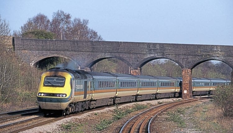
When pushed for his favourite privatised railway scheme there is no hesitation. He cites the original Midland Main Line teal and green scheme with the deer logo, introduced by National Express.
“But it is more than just putting colour on a train,” says Sam. “The design process needs to work with the train architecture and needs to add and enhance the rolling stock style. This can be a difficult process as train operators are presented with a standard train shape from the manufacturers, and livery and branding has to be adapted to work.”
While Ray Stenning worked on the external image for Virgin’s East Coast operation it was alongside Sam, who was involved with the internal image from decor to notices and crockery, ensuring everything worked together, and was complemented by the image of station and on-board staff.
“The East Coast image had to be Virgin, but also had to manage expectations. The architecture of the trains used on East Coast being square and angular is far removed from that of the West Coast ‘Pendolino’ fleet, so just copying the ‘Pendolino’ livery would not work.
“What was achieved was giving East Coast its own, strong image, but at the same time maintaining a family feel with the West Coast operation. There was also a strong staff pride on the route which we needed to nurture. We had to create an image that was new and exciting.
“The challenge of train livery design is, however, further complicated. It must work close up and fit well within the architecture of stations, but must also have impact and stand out in the landscape”.
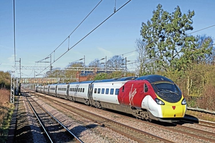
With those pre-requisites Sam believes the Virgin ‘Pendolino’ and ‘Voyager’ liveries meet the requirements, are both iconic and also still look bold and fresh.
Sam also believes the simple addition of black around the windows significantly enhances the appearance of trains. He is also full of praise for the retro-livery recently introduced by First Group’s Great Western Railway, but he does struggle with design looking back rather than a forward-looking livery and brand.
That said Sam believes that although the GWR green livery lacks originality, the company has done well, and he admires the bold approach it has taken in giving a nod to its past. Sam also places the previous Great Western livery, First Group’s Dynamic Lines version, high on his list of successful schemes.
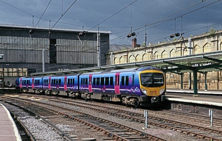
Also singled out by Sam for praise is the new TransPennine Express scheme, which he describes as having “real potential”.
“The designer has done well to create an image that will look fantastic on the new trains, and the preview afforded by the branded Class 68 locomotive allows a glimpse of how it will look in the future. This is a livery designed with the future fleet in mind, which is quite a different way for a train operator to think!”
Another livery Sam praises is the new look for Caledonian Sleeper, which he says exudes “beauty”.
“It does a great job of both inspiring, and being inspired by, the Highland destinations it serves and will suit the new fleet perfectly when they arrive. The new sleeper interiors look
particularly exciting.”
Looking back, the Network SouthEast livery is one which Sam says provided impact and consistency, plus he also rates highly the Roundel design-inspired Railfreight sectorisation scheme, which identified the owning business sector.
I asked Sam what parts of his work at Virgin Trains did he view as a personal success. Top of his list for West Coast was the advertising wrap for the X-Men train which, through the association with Hollywood super heroes, portrayed the message of speed and power.
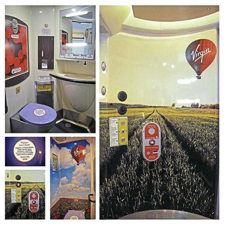
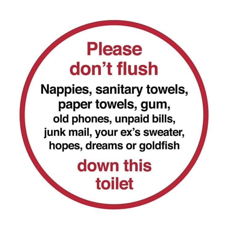
Another success was the information graphic which can now be found in the toilets of West Coast ‘Pendolino’ trains. “Their fleet team identified a need for a message aimed at preventing items being thrown down the toilet and causing blockages.
“We could have just had a simple ‘Do not…..” message, but this was for Virgin so tone of voice was important. I saw this as a unique assignment and came up with the humorous message that has been well received by passengers.”
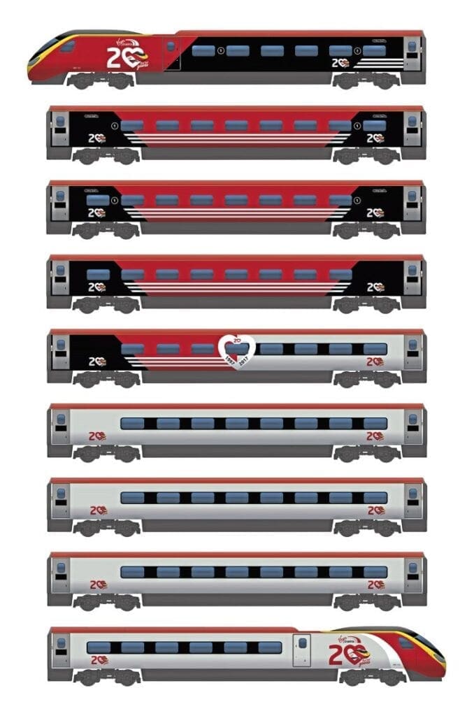
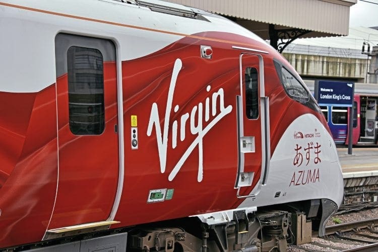
However, in a game of Sam Jessup Top Trumps, both these West Coast projects would be overshadowed by his work on the new East Coast ‘Azuma’ trains. Indeed, Sam believes the ‘Azuma’ design project, which saw the creation of the launch identity for the train, was the biggest success of his design career, and although he had a blank canvas he only had a short timespan to achieve it.
“When I started on the project the train didn’t even have a name. I was involved in creating a link into its Japanese heritage, while also creating something that fits into the train ‘family’ of Virgin. All Virgin trains have a strategy to their names so I worked with the communications team to agree the name.
“Naming the types of train makes them less mechanical and gives them a real personality.
“As part of the ‘Azuma’ project I extensively researched the Japanese culture, mixing it with my in-depth knowledge of the Virgin brand, and took inspiration from the history of the East Coast Main Line, to come up with the look the train has now.”
Sam admits he is always on the look-out for inspiration and has built up an extensive image library, which is not just of trains and railways. He says he is most inspired when he is in that environment, so when working on station-related work he visits stations.
While the ‘Azuma’ project started with a blank canvas, another project for which Sam received high acclaim was the creation of the special livery for HST power car No. 43238 National Railway Museum 40 Years 1975-2015.
Here, Sam took the base Virgin Trains East Coast livery, which had been devised by Ray Stenning and Best Impressions, and worked with the team at the National Railway Museum in York to celebrate 40 years and eight iconic locomotives from the National Collection in a unique, bold, graphic way.
The resulting livery went down a storm with Virgin Trains, the NRM and rail enthusiasts across the UK. Even Ray Stenning commented it was ‘his favourite’ adaptation of the base livery he created.
Sam also has an eye for originality even where the subject matter is from the annals of history. Having bought a copy of the reprinted British Rail Corporate Identity manual he was struck by how celebrated and iconic design of the past had been. He wanted to do his own tribute and produced a piece of artwork which uses abstract colours, but with an outline of an InterCity 125 superimposed.

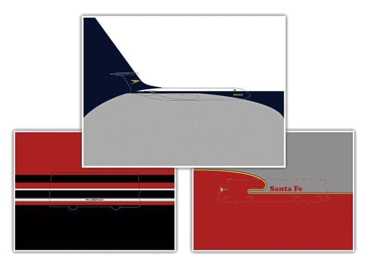
Such was the interest in the artwork, Sam extended the range to cover other iconic British trains. He has also worked on buses and aircraft, and has plans to include US and Canadian locomotives of the 1950s, 60 and 70s. The range, which Sam has called Liveries Unleashed, uses the colours of the livery which are ‘unleashed’ beyond the vehicle profile. ■
Creating the ‘Azuma’: The design inspirations
THE name ‘Azuma’ has been chosen to launch the new Virgin Trains East Coast fleet, and present it in its own unique identity and style.
The name ‘Azuma’ comes from a historic Japanese term meaning ‘east’ and was often used to refer to the eastern region of Japan. It also carries connotations of speed, dynamism and modernity, and fits perfectly into the Virgin Trains’ family naming collective, alongside ‘Pendolino’ and ‘Voyager’.
The concept of ‘the east’ holds special meaning in Japanese culture. The sun rises in the east and is seen as the giver of light, heat, and of life itself. According to Japanese tradition, the country’s imperial family is descended from Amaterasu, the sun goddess, hence the nation is often referred to as the land of the rising sun; in fact the Japanese name for Japan is Nippon, which translates as Sun Origin.
The eastern connection also references the special route the new trains will run on – the famous East Coast Main Line. Linking our nation’s biggest and brightest cities, and playing host to British industrial history, the East Coast Main Line is not just a train line, it’s the historic spine of Britain, tying together nations, people and cultures.
By paying tribute to a historic Japanese term for east in the name, and referencing the world-famous route the train will operate on, together Virgin Trains and Hitachi are signifying a new dawn, and heralding the rising sun in a new era for rail travel.
However, it’s not just the name that is special… the unique combination of white with red cloth motifs for the wrap is also taken from Japanese culture and tradition.
The colour red symbolises many things in Japan; it is the colour of blood and fire and in the Japanese mind it represents life and vitality. It is also seen as the colour of the sun: a symbol of energy, radiating its vitalising life force into human beings, hence its addition on the Japanese national flag.
Red is also looked upon as a sensual colour, and can be associated with a person’s most profound urges and impulses.
The white of the train contrasts against the sharp bold red flowing cloth motifs and is inspired by the term kōhaku, which literally translates as ‘red and white’.
It mixes the concept of life and vitality (red) with purity (white). These two colours, when applied together, are seen to denote happiness, celebration and good fortune in the future.
This can be seen in such examples as kōhaku maku, a red and white stripe curtain, which is often hung at celebratory events and on formal occasions across Japan, or kōhaku manju, a pair of red and white sweet buns (wagashi), often served at weddings to commemorate the occasion and wishing the couple good luck.
Red and white also have special significance in the Japanese Shinto religion. Red is seen as the colour of the dress of gods and spirits, whose purpose is to ward off evil spirits and disease. In fact, Shinto priestesses (kito), who attend to Japanese temples, wear robes formed of flowing red and white clothes: red to symbolise the gods and white to show purity.
The ‘Azuma’ red and white wrap does more than just look good, it celebrates mixing the boldness of the Virgin brand with the technological prowess and knowledge of Hitachi, and commemorates this historic unveiling of a new fleet of high-speed, high-tech trains, which will push the industry into the future. (Source: Virgin Trains)
Read more News and Features at https://www.therailwayhub.co.uk/ and also in the latest issue of The Railway Magazine – on sale now!